spies, private eyes, and detectives... (Page 4)
for a complete alphabetical list of ALL reviews start here
A
- B - C - D
- E - F - G
- H - I - J
- K - L - M
- N - O - P
- Q - R - S
- T - U - V
- W - X - Y - Z
 Rick
Mason, The Agent 1989 (SC
GN) 80 pages
Rick
Mason, The Agent 1989 (SC
GN) 80 pages
Written by James D. Hudnall. Illustrated by John Ridgway.
Colours: Lovern Kindzierski. Letters: Ken Lopez. Editor: Carl Potts.
Additional notes: tabloid dimensions.
Rating: * * * (out of 5)
Number of readings: 1
Published by Marvel
Rick Mason, The Agent is a kind of hybrid story, mixing espionage-adventure, with super hero fantasy. Rick Mason is a freelance secret agent with no super powers, but whose assignments generally embroil him with super powered people. In this case, rumours of super powered people plotting political coups in third world nations -- and actually pulling one off -- sends Rick down to a South American country that, after enduring a succession of hard right and hard left dictatorships, has recently been taken over by a small cadre of super villains. Rick's assignment: to figure out what's behind it all, and stop it.
I had assumed this would just be a story set in its own reality -- but it turns out it is actually supposed to be the normal Marvel Universe, with both super spy Nick Fury (who assigns Rick to the job) and villain The Kingpin (in a minor role) cropping up. Though otherwise, it's not really connected to existing Marvel lore. And presumably the idea was to play around with the quirky idea of a "normal" hero tackling super villains.
Sort of.
The problem is, clearly what's also inspiring writer Hundall is the notion of writing a James Bond adventure. So we have a tough-but-suave secret agent travelling to exotic locales, and with the usual libidinous escapades where women seem to melt into his arms at the drop of a hat. He can make short work of normal opponents -- and doesn't have too much trouble even with the super variety. That's partly thanks -- again in shades of Bond -- to a few gadgets. James Bond isn't exactly a "realistic" character himself. In other words: though he may not wear tights, Rick ultimately does just come across as a super hero.
I had sort of assumed the story would be about a kind of everyman hero who triumphs through wit and wile against people much more powerful than he is. Instead he's more just Batman or Captain America -- sans costume -- or, as I say, James Bondd.
As such, there seems less novelty to what I had assumed was supposed to be a novel premise. Then again, maybe I just misunderstood.
The James Bond angle may also reflect the problem American comics face, given the market is so dominated by super heroes. Perhaps Hundall did just want to write a James Bond-type comic, but could only get an editorial okay if he added in some super beings.
On the level of a James Bond movie (with super beings) it's certainly an okay page turner. Artist John Ridgeway has a realistic style that suits the idea of a hero in civilian clothes, and where the locations (starting out in Hong Kong and moving to South America) are part of the atmosphere. The art is moody, and with generally good composition, including a nice use of big panels and splash pages. It's also bright and clear (some other art by Ridgeway I'd seen was a bit overly dark and murky -- so maybe also give credit to colourist LLovern Kindzinski). It's some 72 pages long and though I won't say it's breathlessly paced, it nonetheless moves along efficiently.
But with that said: it's equally fair to say it's a generic James Bond (or other mercenary/"Men's Adventure Magazine"-type) story. There's some running about, escapes, captures, shoot outs, etc. But nothing -- and no one -- that necessarily stands ouut from the crowd. Rick, as mentioned, is basically just a James Bond substitute, without being Bond, nor without being enough different or idiosyncratic to establish his own personality. He hooks up with feisty senorita who is associated with the local rebels -- but, honestly, she makes some Bond-girlss seem three dimensional. Likewise, the villains are basically just villains. The story is meant to have a bit of a twist toward the end as to who's behind it all -- but you can see it coming. Not the least because, as is often the case in comics, there aren't that many characters to suspect.
Ultimately Rick Mason, The Agent is one of those books it's hard to quite review. It's attractively illustrated, and decently paced, general holding together logic-wise, and holds your attention sufficiently throughout. But the mix of secret agent and super heroes, instead of creating a unique hybrid, just ends up seeming like a kind of familiar version of both, with neither characters or the plot really standing out. A decent read, but inside it carries a sub-title ("Foreign Devils") which might imply Hundall and co. were hoping this would be the first of many adventures. But so far as I know -- there weren't.
Original cover price: $9.95 USA.
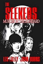 The Seekers: Murder in the Boneyard Club (2013) 48 pages
Written by Les Lilley. Illustrated by John Burns.
Black & white
Rating: * * 1/2 (out of 5)
Number of readings: 1
Reviewed: Feb 2020
Published by Lucky Comix
The Seekers was a 1960s British newspaper strip about a private organization that specializes in missing persons cases. It was seen as a bit of a cross between Modesty Blaise (the popular, grown up-aimed comic strip about spies) and a TV show like The Avengers (at least in that the leads were a man-woman team). Some 50 years later or so, Lucky Comix reprinted a couple of the storylines in graphic novel format. The first volume, Murder in the Boneyard, reprints the first storyline, "The Boneyard Club." (The second is reviewed below this review).
In a slightly controversial decision, they didn't just reprint the comic strip, but reformatted it to make it more like a comic book -- including changing the size of some of the panels so they aren't as rigidly uniform as in a newspaper strip. But in doing so the images are occasionally distort a bit -- stretching the figures. It seems like a problematic decision, but I wonder if the reason was more than aesthetic, and is a way of asserting ownership. In the copyright notice it's pointed out that this formatting is unique to the Lucky Comix edition and so any use and/or reproduction of this version of the comic strip will be a violation of their copyright. (It's possible the original strips might even be in the public domain -- but I don't know).
It doesn't ruin the art too much -- and the art is definitely seen as one of the series' strengths among aficionados. Artist John Burns has a striking, realist style (married with a sense of mood and atmosphere) to further the sense of the series being grown up, and evoking a TV series.
The problem, to an extent, lies with the writing. Not that the writing is bad (particularly in contrast with TV series at the time), just that it's a bit bland. Now obviously this being the first storyline, one can expect a certain aspect of just testing the waters. But the characters have just enough personality to not be anonymous -- without enough to quite be interesting. The central characters are Jacob Benedick and Susanne Dove -- he's a bit crusty and cynical, she's a bit spunky -- and their no nonsense boss, Una Frost (it's both interesting that she's a woman, given the sexist era, while equally part of a tradition of no nonsense British matrons in film & literature). And there's Duffy, sometime secretary to Una, sometime field agent, and who serves as a kind of cockney comic relief.
The plot involves a young women who witnesses a guy being beaten up at an exclusive club, The Boneyard, where many patrons where skull face masks. But because of the masks she can't identify the victim, or his attackers, and when she goes to the police, everyone at the club deny the incident happened. Which leads her to The Seekers to try and find the missing guy (a case Una agrees to take on, pro bono, much to Jacob's annoyance).
There is some investigating, some fighting, some getting captured/escaping. It moves along at a brisk tempo (as you'd expect for a story originally intended to be read in daily instalments). But it's also pretty rudimentary. It's not like there's much characterization of the "guest stars," nor are there a lot of twists or surprise turns; for all the weirdness of a club where everyone wears skull masks the criminality being covered up is fairly mundane and mercenary (it's not like it's some secret society or occult cabal).
But as I said earlier: it does remind me of a kind of generic TV episode, circa the time. And maybe once the characters develop a little more presence (or the reader grows to like them more) that is enough. I likened The Seekers to Modesty Blaise -- but it's not on the same level as Blaise (at least at this point).
I mentioned that it feels "grown up" and I should clarify that. Both because newspaper strips can often vary in who their target audience is (given newspapers are potentially read by the entire family) and especially British strips which, at least back in the day, could be quite "adult" with sci-fi strips like Axa featuring regular nudity! Well, The Seekers isn't "grown up" to that degree (at least not here, though later strips got more racy!); by grown up I simply mean that in terms of the plot and the characters it feels like something aimed equally at adults as kids (I get back to my likening it to a contemporary TV series, albeit by modern standards even some adult TV series in the 1960s can seem more juvenile, or at least corny).
Anyway, Murder in the Boneyard Club is, to be honest, neither good nor bad. Boosted by attractive art by John Burns, it's an agreeable episode from a modest series.
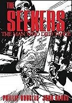 The Seekers: The Man Who Died Twice (2014) 48 pages
Written by Phillip Douglas. Illustrated by John Burns.
Black & White
Rating: * * * (out of 5)
Reviewed: Feb. 2020
Suggested for mature readers
Number of readings: 1
Published by Lucky Comix
This the second of (what possibly were only two) graphic novels from Lucky Comix collecting storylines from a 1960s British newspaper strip, The Seekers, which ran in The Daily Sketch tabloid (the first collection is reviewed above). The series followed two agents for a private missing persons agency, Jacob Benedick and Susanne Dove.
The first volume reprinted the first storyline. This story is selected from somewhat later in the series' run (I think I read it was the 17th storyline). And it's arguably a slightly stronger arc -- though whether that's because of a new writer taking over, or merely that the first story was, by necessity, just feeling its sea legs, I don't know. But it's a little more intriguing at first, involving the duo called in to investigate when a school teacher, who supposedly died and was buried a few months before, is spotted alive in a seaside town. (Although it's interesting that both this story and the previous, Murder in the Boneyard Club, draw upon spooky, creepy imagery -- here a dead man coming to life, literally crawling from his grave; the previous story featuring a club where patrons wear skull masks -- even as the ultimate plots and solutions aren't supernatural or even particularly strange).
To be frank, Jacob and Susanne still haven't really shouldered their way to the top of any crime solving duos, personality-wise. Jacob is cynical and rough-around-the-edges, Susanne is plucky, but generating little real chemistry between them. They're no Modesty & Willie (from the comic strip Modesty Blaise) or Steed & Emma (from TV's The Avengers).
Still, as a story, The Man Who Died Twice moves along, keeping you just intrigued enough to want to see where it's all headed. The plot mixes low-key investigation (as the duo track down their quarry, still not entirely sure if a "crime" has even been committed) with danger and thrills (as dangerous types get involved and Susanne is dumped in the river) and some nice changes in scenery, from sleepy seaside resorts to a climax on a moving train.
Here it's worth drawing attention to one of the series' biggest assets: veteran British artist John Burns, who renders those sceneries, and who has a realist style, that is also rich in mood and atmosphere. A great degree of the comics appeal is his visuals. Although that is ironic, given a criticism of the Lucky Comix presentation is that they sometimes stretch and distort Burns' art (as they vary the panels to make it read less like a newspaper strip collection, and more like a comic book/graphic novel -- and possibly to assert copyright on this "new" presentation)
I mentioned in my review of the first volume that British strips of the time could be surprisingly "adult" in a way not usually seen in mainstream North American newspaper strips. That wasn't much in evidence in the inaugural storyline, but here it does manifest in a couple of "nip-slips" (to use contemporary jargon) while Susanne changes her wardrobe and in some racy paperback covers (the missing school teacher was also a novelist). It's not often or very explicit -- but definitely racier than the average Dick Tracy or Mary Worth collection!
To be honest, when you get to the solution of the story, it ends up being rather prosaic, obvious, and -- weirdly -- a bit ambiguous in the specifics. Still, it was an engaging enough romp. And I'd probably suggest if you were curious, to start with this volume, then pick up the first one if you enjoyed this -- rather than vice versa.
Silencers 2007 (SC TPB) 112 pages
 Written
by Mark Askwith. Illustrated by R.G. Taylor.
Written
by Mark Askwith. Illustrated by R.G. Taylor.
black & white. Letters:Ron Kasman. Editor: Gary Reed.
Reprinting: Silencers #1-4 (Caliber Comix - 1991)
Additional notes: intro by Askwith.
Rating: * * * (out of 5)
Number of readings: 1
Reviewed Mar. 2012
Published by Image Comics/Desperado Publishing
Free piece of advice to aspiring comic book creators: don't call your series "silencers". After all, in 2003 there was an entertaining series under that title about a bunch of gangster-super-villains-as-protagonists...that, despite good reviews, failed to catch on with the audience (reviewed elsewhere on this site). And long before that was this unrelated 1991series set in the milieu of Cold War espionage. Granted -- it was a "mini-series", but I'm guessing creators Mark Askwith and R.G. Taylor were hoping to do further tales about their plucky heroes...but the dice didn't roll that way.
Although a decade and a half later the series has been re-released as a TPB in a joint venture between Image Comics and Desperado Publishing, so clearly it struck favourable chords.
It's a black and white independent comic about spies...but this isn't the high octane action of The Black Widow or James Bond. No, this is the murky, sedate spy world of John LeCarre where sometimes frumpy protagonists struggle, not so much to achieve victories...but dignified stalemates.
Though its publishers, first Caliber Comix, then Image, are American, it's created by Canadians Askwith and Taylor, and set within a fictional Canadian spy agency. Actually, at first that's not entirely clear -- the characters aren't American (as the Americans are referred to in the third person) but one can mistake them for being British, and at one point a dart playing agent makes wagers in "pounds". Yet by the second issue, it's made explicit these are Canadians, and you half wonder if the creators were just insecure at first, maybe not having decided whether to make the characters Canadian in the first issue. But by the third issue the confusion is made a bit clearer, as it turns out these are Canadian agents operating out of the U.K. bureau of their department...explaining why there only seem to be a handful of operatives.
Still, the fact that even such a little thing as where these characters are and what country they represent should take a while to become clear is perhaps an indication of a slight storytelling problem.
Spy stories, particularly these kind of cynical, world weary tales are supposed to revel in a murky obliqueness, so maybe it's deliberate. Likewise, we are kind of thrown into the deep end of the environment without water wings, character names tossed about willy nilly, so it's an issue or two before you can comfortably get a sense for who the characters are...and what name goes with who!
In that respect, the art is also a culprit. Taylor uses a scratchy penmanship, with lots of loose and extraneous lines, maybe putting me in mind of some old Modesty Blaise comic strips by Neville Colvin and others. It's mainly thin lines as opposed to much in the way of thick lines or shadows. Yet it's almost photo-realistic at times -- and quite striking. In fact, it's literally photo-referenced, with many of the characters modelled after friends and acquaintances (and possibly celebrities -- I'd swear one character toward the end is actor Joe Don Baker). Indeed one agent, Graham Glass, was modelled after their fellow Canadian comic book writer-artist, Seth, who sometimes draws himself into his slice-of-life stories -- so there might be a certain weirdness to seeing a familiar face (or, at least, character design) in an unfamiliar setting, as though an actor taking on another role. But though I kind of liked the art...I think it's part of why I had a bit of trouble keeping track of the characters, because some aren't as obviously distinct from each other as they could be. And the photo-referencing can lead to a bit of stiffness in the poses. And there are some odd artistic experiments -- like some panels where Taylor tilts his figures on an angle...but draws the background level!
Still, since some have argued the "boom" period of indie comix in the 1980s-1990s basically went bust because of too many substandard products flooding the racks, whatever its flaws, Silencers is a slick, professionally put together effort.
At the same time, I can get a bit cynical about the deliberate "murkiness" of such spy stories, and the story telling conceits even in similar novels and movies. Having a sneaky suspicion that that obliqueness is being used to make the story seem more profound and enigmatic than it is...and, frankly, to plaster over gaps in the plot.
Because the plot of Silencers is a bit vague, meandering about a bit, where even when people are killed, or bombs go off, you're not entirely sure who or why, and then kind of resolves in a shaggy dog fashion. There are two main threads to the saga -- one involves an attempt to extract an East German defector that goes wrong in the opening pages, resulting in the critical injuring of a Canadian agent. The other involves a simple courier job, done as a favour to the Americans, that also goes wrong, and uncovers evidence of a chemical weapons smuggling ring. The East German defector was a chemist, and the two cases are (we infer) connected.
Actually, flipping back through the pages, I realize there are references that anticipate certain revelations, and explanations that, if not always explicit, at least point the way to connections. But maybe that's what I mean about using a deliberately murky style to obfuscate...because when you connect what dots there are, it doesn't necessarily form a particularly complex picture or offer surprise twists. And, as I say, where you still don't know precisely who did what...in the sense of who actually this assassin or that is specifically working for, or what's in such-and-such a file people are hiding, or self-destructing. It's a bit like a story that's playing around with the form of a spy story, but considers the content less important.
Maybe it does hold together a bit better with subsequent readings...but it needs to be entertaining and intriguing enough the first time through that it invites -- nay, demands -- you drag it off the shelf again. And to be fair -- it's okay enough that I'm not saying I'd begrudge flipping through it again on some rainy day, but it's not like there are stunning plot twists, or particularly exciting action scenes (despite occasional shooting and fighting) -- after all, the whole point is to be a kind of low-key story of people in trenchcoats who mutter cynically about the pointlessness of their occupation.
Askwith had also collaborated on The Prisoner mini-series for DC Comics (reviewed above) -- which was based on the cult TV series, but emphasizing cold war espionage over the sci-fi parables of the television program. And I can certainly detect a similar, muddled storytelling style in the two works.
With all that said, and despite my suggesting I found even the characters a bit hard to identify at first, there is an appeal to Silencers...and surprisingly, it is the characters. Particularly department head Ian, who despite being the senior agent, is in a sense the outsider -- his background in science, not subterfugge -- and very much the kind of LeCarre-esque bureaucrat more than a debonair super spy. While Glass is the opposite extreme, clearly meant to be the "cool" agent, but in an atypical way, with glasses and cigarette, almost effete, but clearly the guy you'd most want watching your back...and the last guy you'd want to cross. The others wander about in the middle, but gradually start to develop presence and personalities. As well, by making the characters Canadian it adds a slight variation on the espionage cliches...even if it's doubtful Canada has a spy network even on this level! And though not "anti-American" they can present a more realistically grey shade world than most American-centric spy stories -- one where the Americans are the heroes' allies, but not always certain ones.
As I say, this was a mini-series -- it's not like it ends in mid-plot, or like it was cancelled prematurely. But I'm guessing the creators wouldn't have been adverse to telling further tales about the characters, and despite some of the flaws...I can't say I would've been entirely adverse to seeing if they could've smoothed off the rough spots in subsequent tales.
Cover price: __.
BACK TO < Spies & PIs Page Three
